ÉLAN
Élégance Brute: refined meets raw
Brand identity2026View project →Graphic designer based in Amsterdam.
Branding / illustration / web / print + more
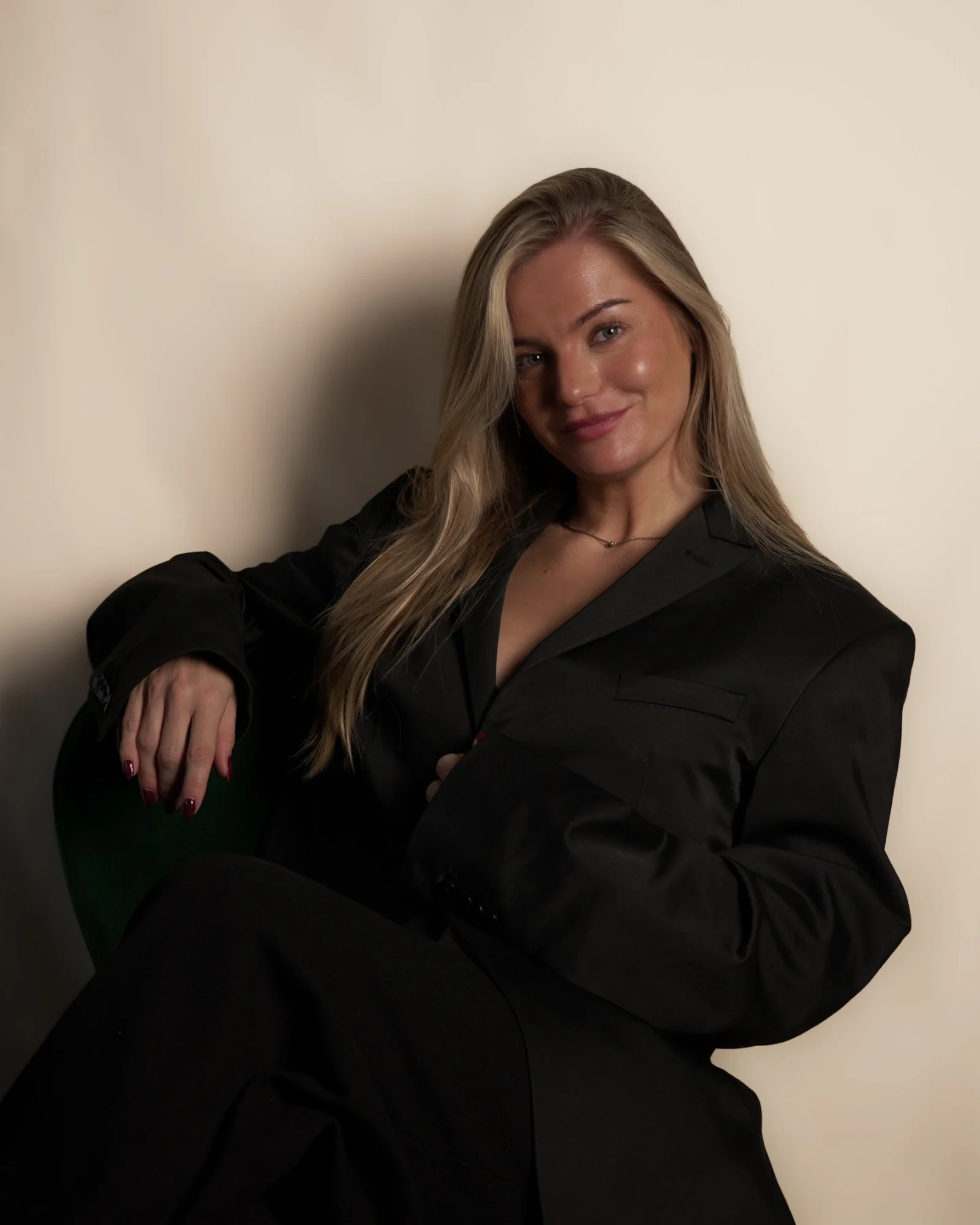
I’m a graphic designer in Amsterdam. Alongside my in-house role, I take on a select number of freelance projects for brands with a story worth telling: independent businesses, creatives and personal brands. Whether you’re just starting out or ready for a fresh look, let’s talk.
Selected clientsÉlan, HIMA, Lucky Duck, Café Café, Pesca, Bar Staal, Vooges, Scotch & Soda, Veloretti, Sanna Botter
Every project starts with a conversation. I want to know your story, your audience and what makes you different.
I explore directions and sharpen them into one clear concept, so we know what the brand should feel like.
The concept grows into the full picture: logo, colours, type, illustration and every touchpoint.
You receive all final files, ready for print and web, so your brand looks good from day one.
Make it playful. Make it last.
 © 2026 Nikki van Kooten · Amsterdam, NL
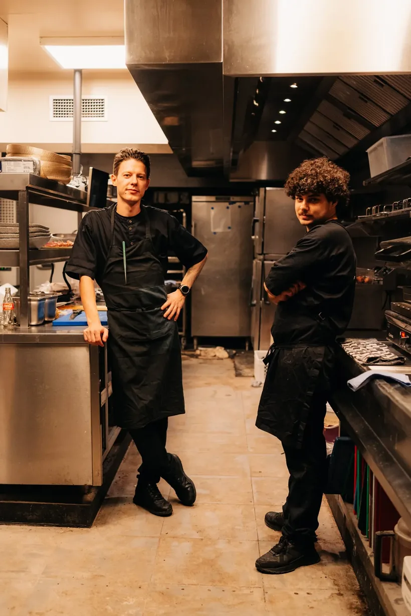
Élan is a new neighbourhood restaurant in De Pijp, Amsterdam, and the second venture from the owners of ROUX. Looser, warmer and more accessible, without compromising on quality: the refinement of a fine kitchen, with the warmth of pulling up a chair at a friend’s table.
That tension became the concept: Élégance Brute. Refined, with marble, set tables and candlelight; raw, with leather, wood, cast iron and honest ingredients. The wordmark follows the name, French for momentum and spirit: italic, leaning forward, with strong contrast between thick and thin, like a movement on paper.
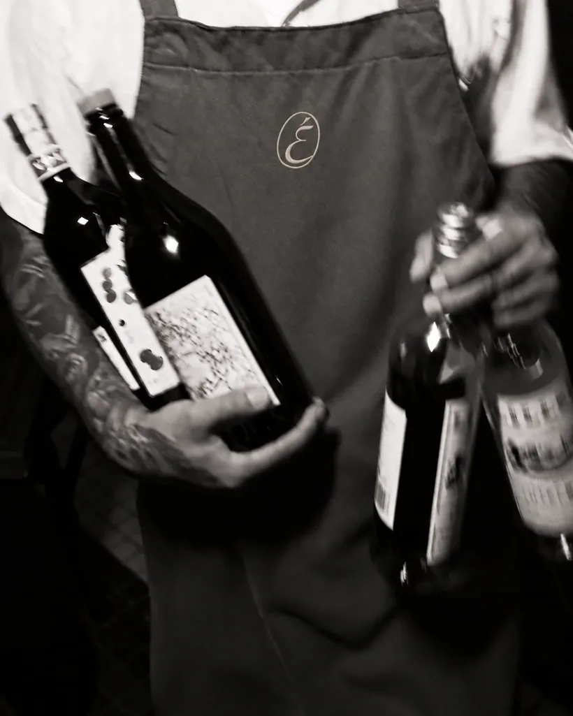
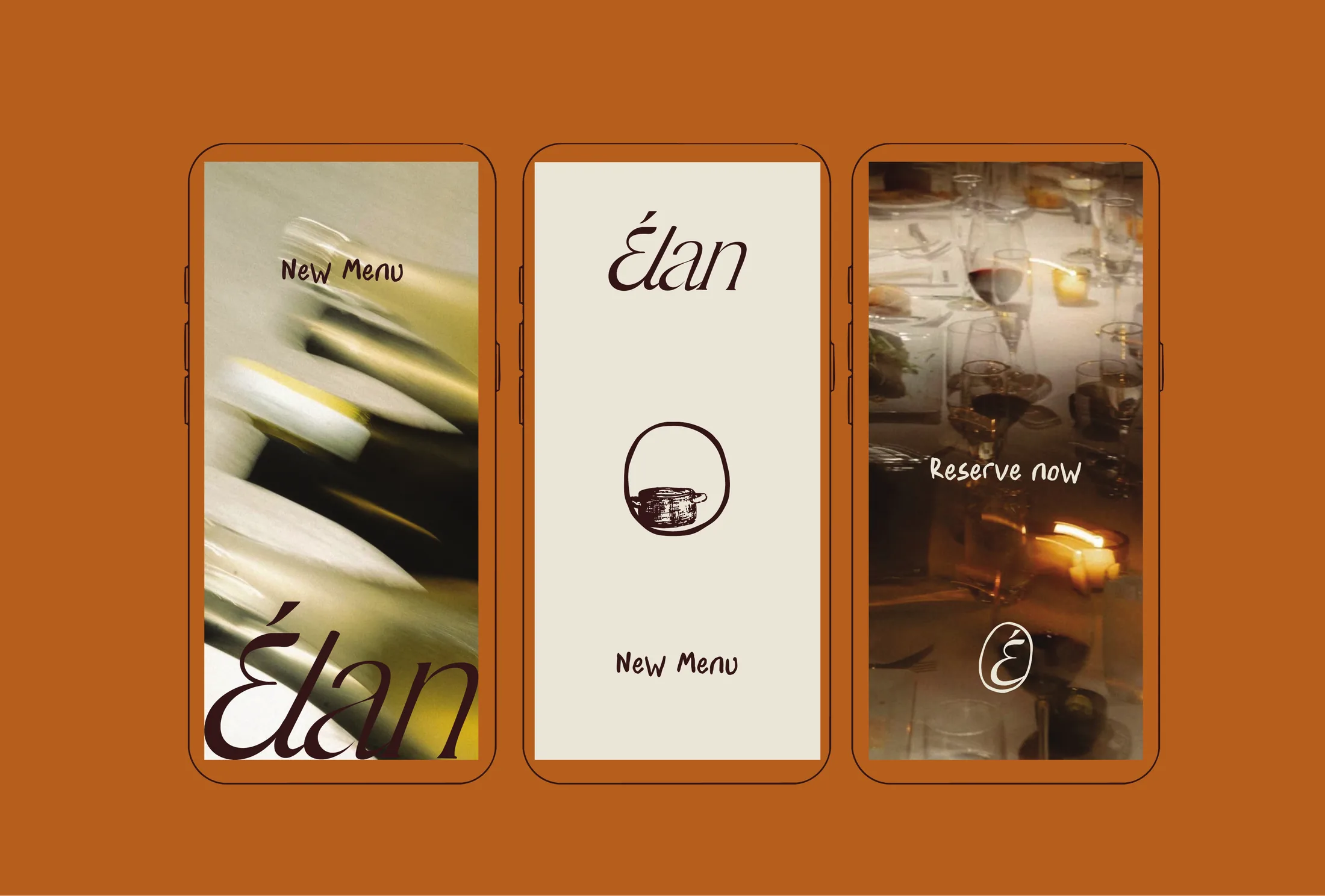
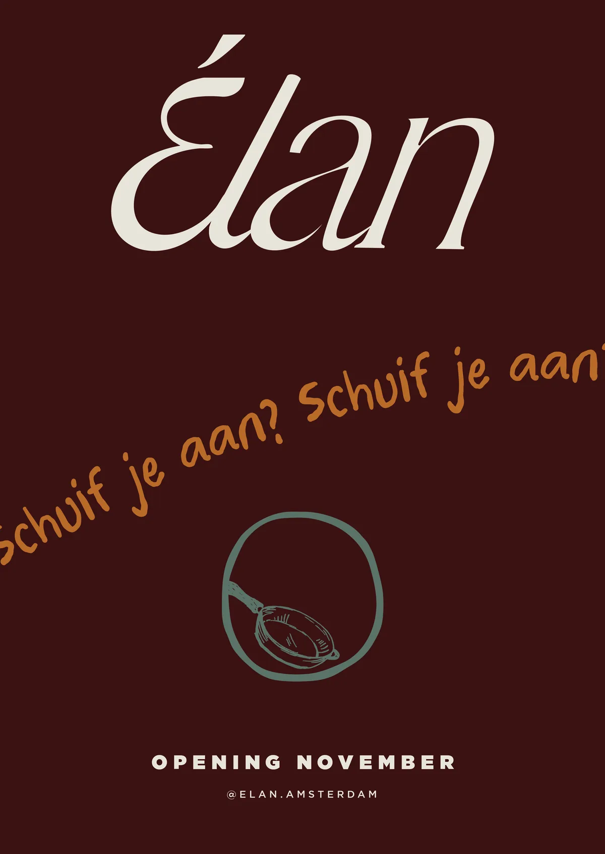
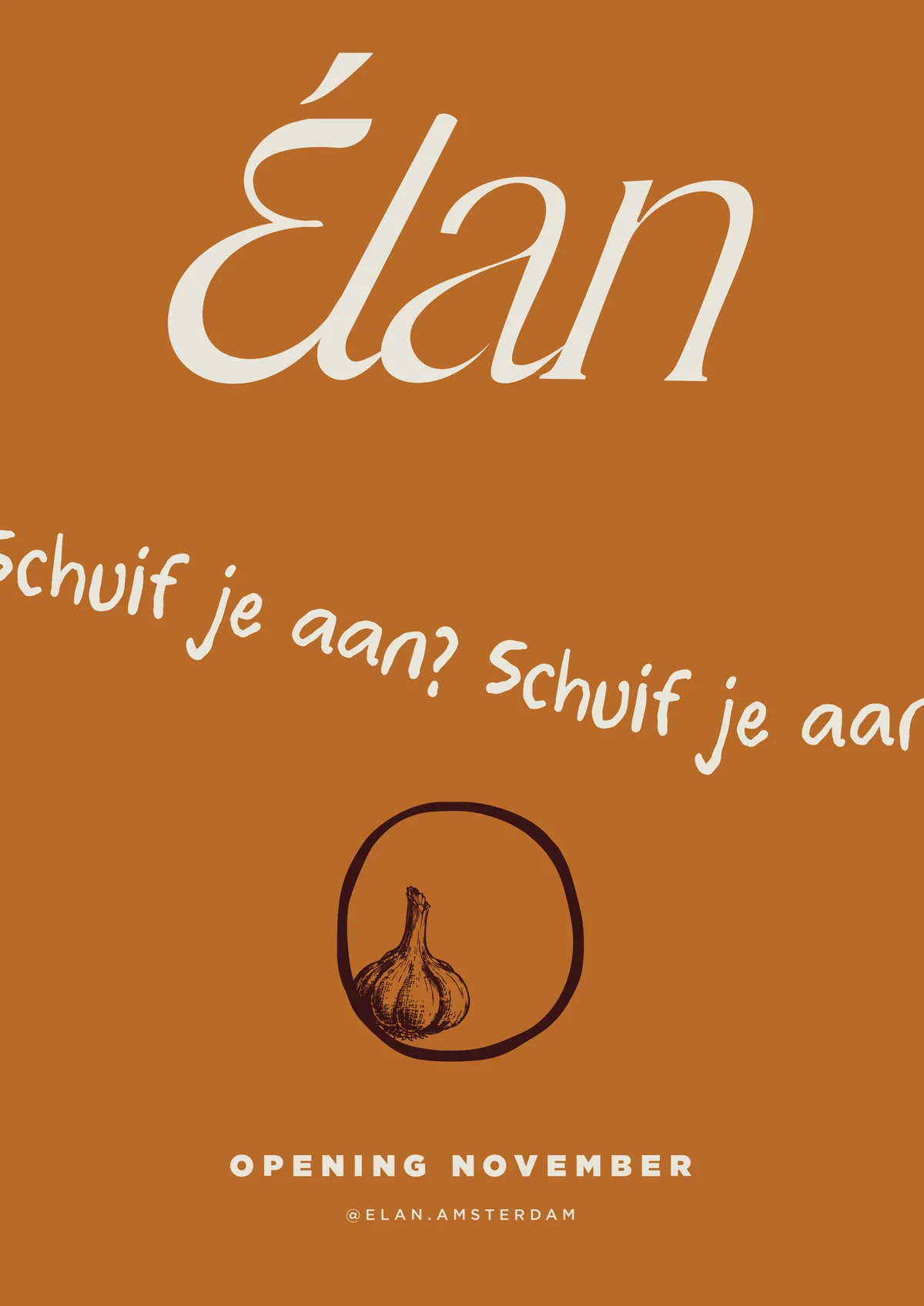
Around it grew a complete identity: a monogram for small formats, a palette of bordeaux and linen with champagne, burnt amber and sage as accents, a typographic system and a series of hand-drawn kitchen objects. For the opening, three window posters let “Schuif je aan?” (“Pull up a chair?”) run from window to window.
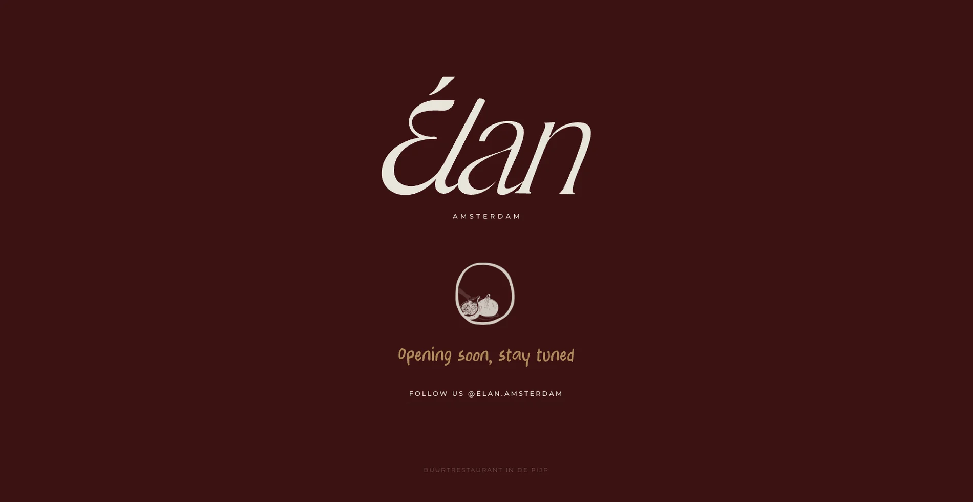
Everything comes together online: a landing page that builds anticipation for the opening, and a brand portal where the team can download logos, illustrations, print files and templates, so the brand stays consistent long after the launch.
 Amsterdam
Opening, October 2026 · Photo: Linde Berends

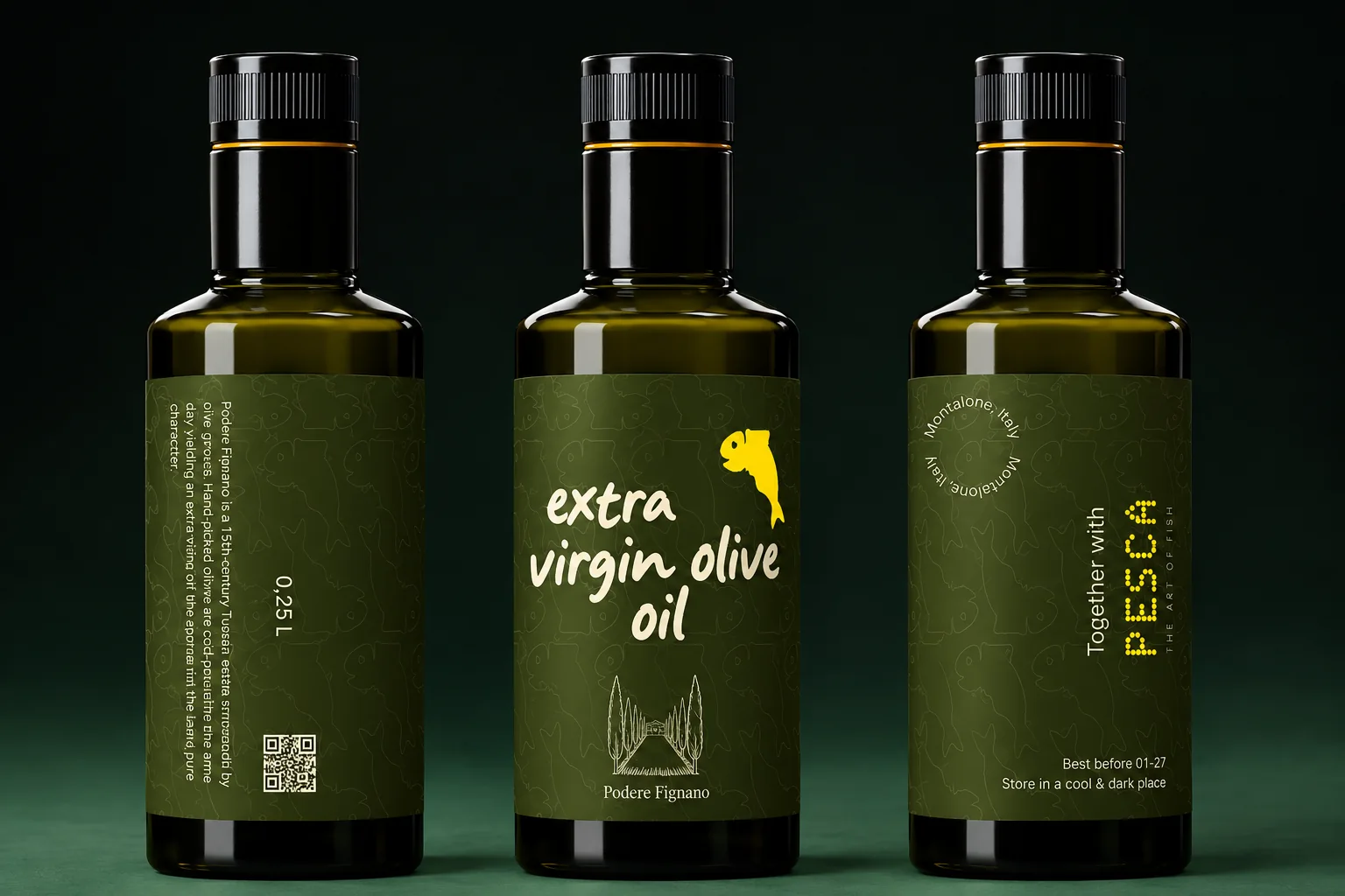
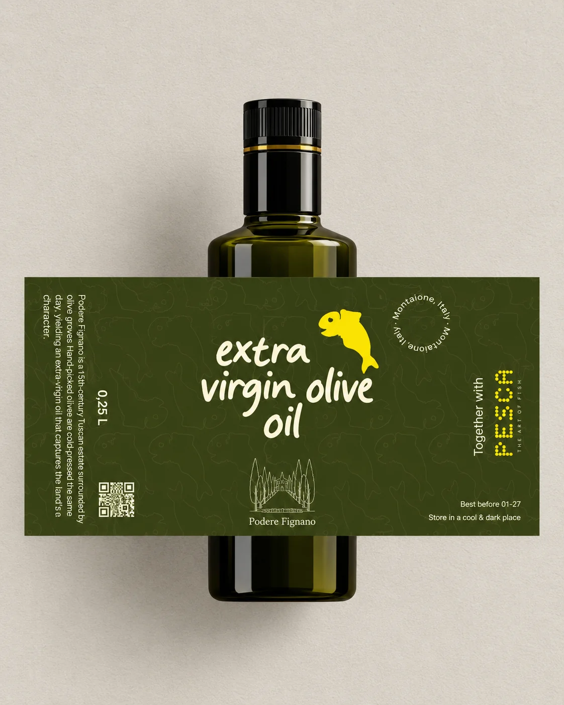
A private-label extra virgin olive oil for Pesca, made with Podere Fignano, a 15th-century estate in Tuscany. A hand-lettered label in deep olive, with Pesca’s jumping fish and a line drawing of the estate.
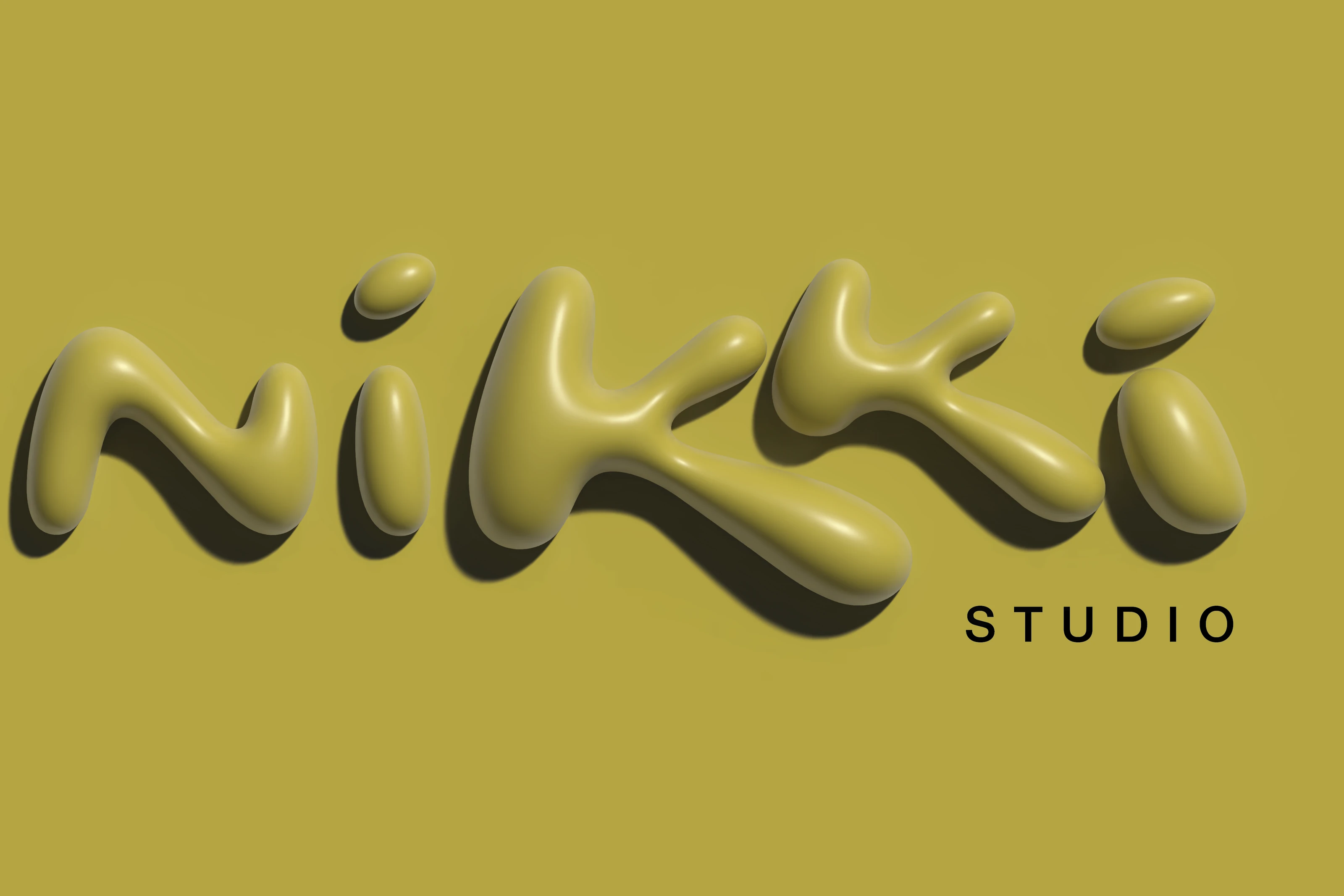
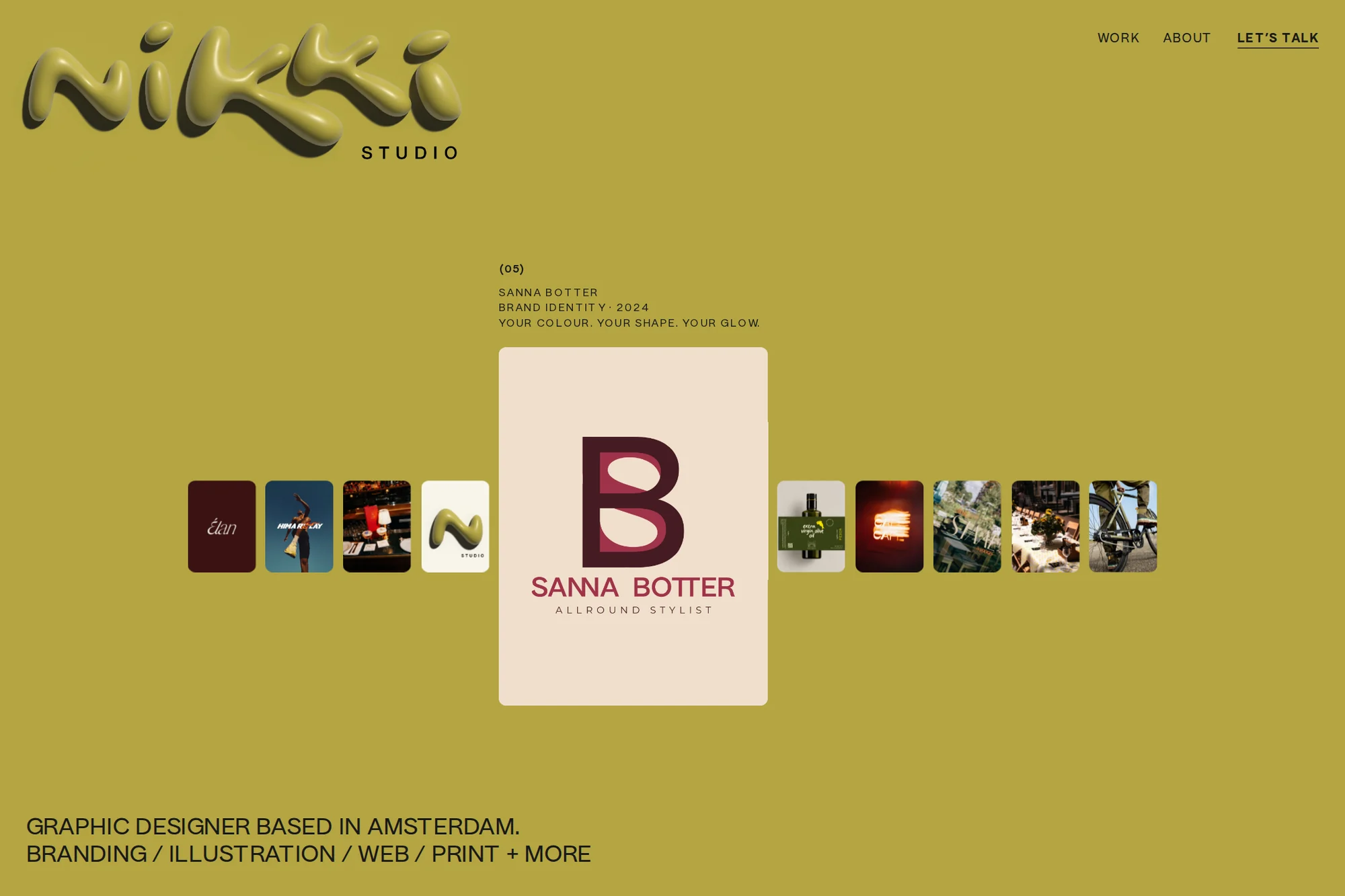
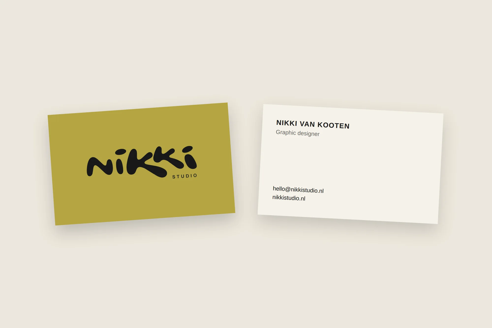
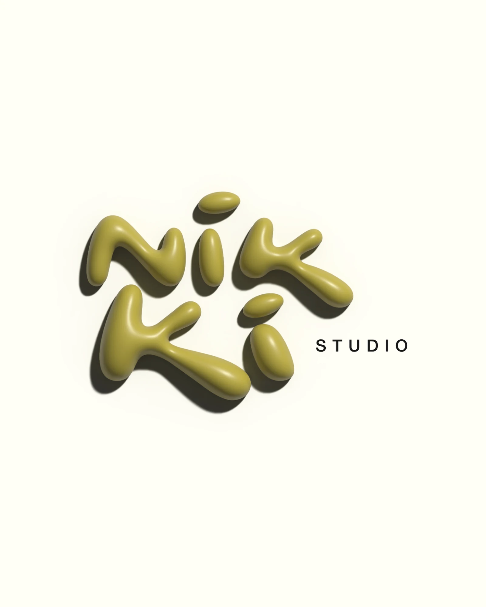
My own studio identity. A liquid, hand-shaped wordmark rendered in 3D, paired with a calm palette of olive, cream and ink, and carried through a brand book, business card and this website.
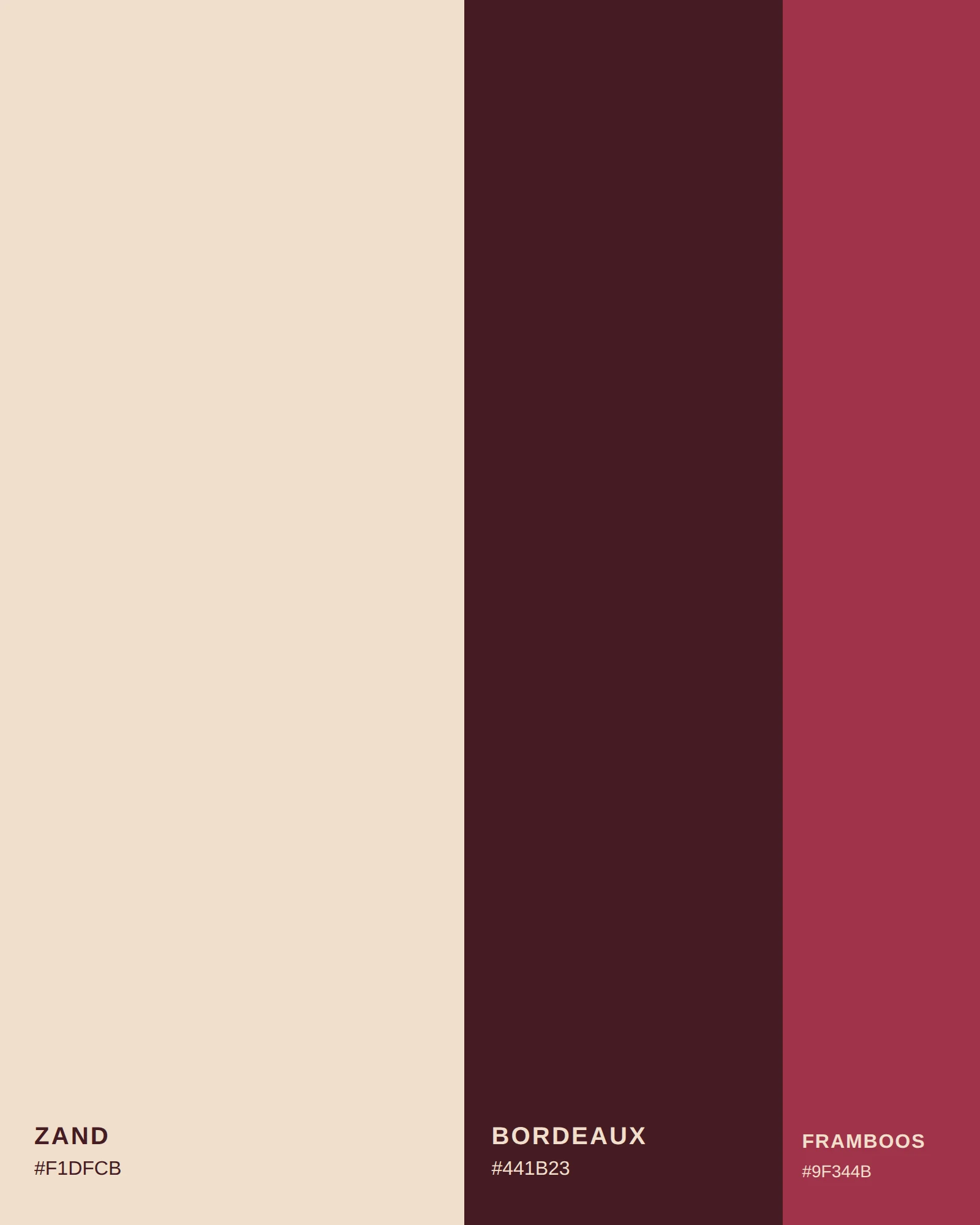
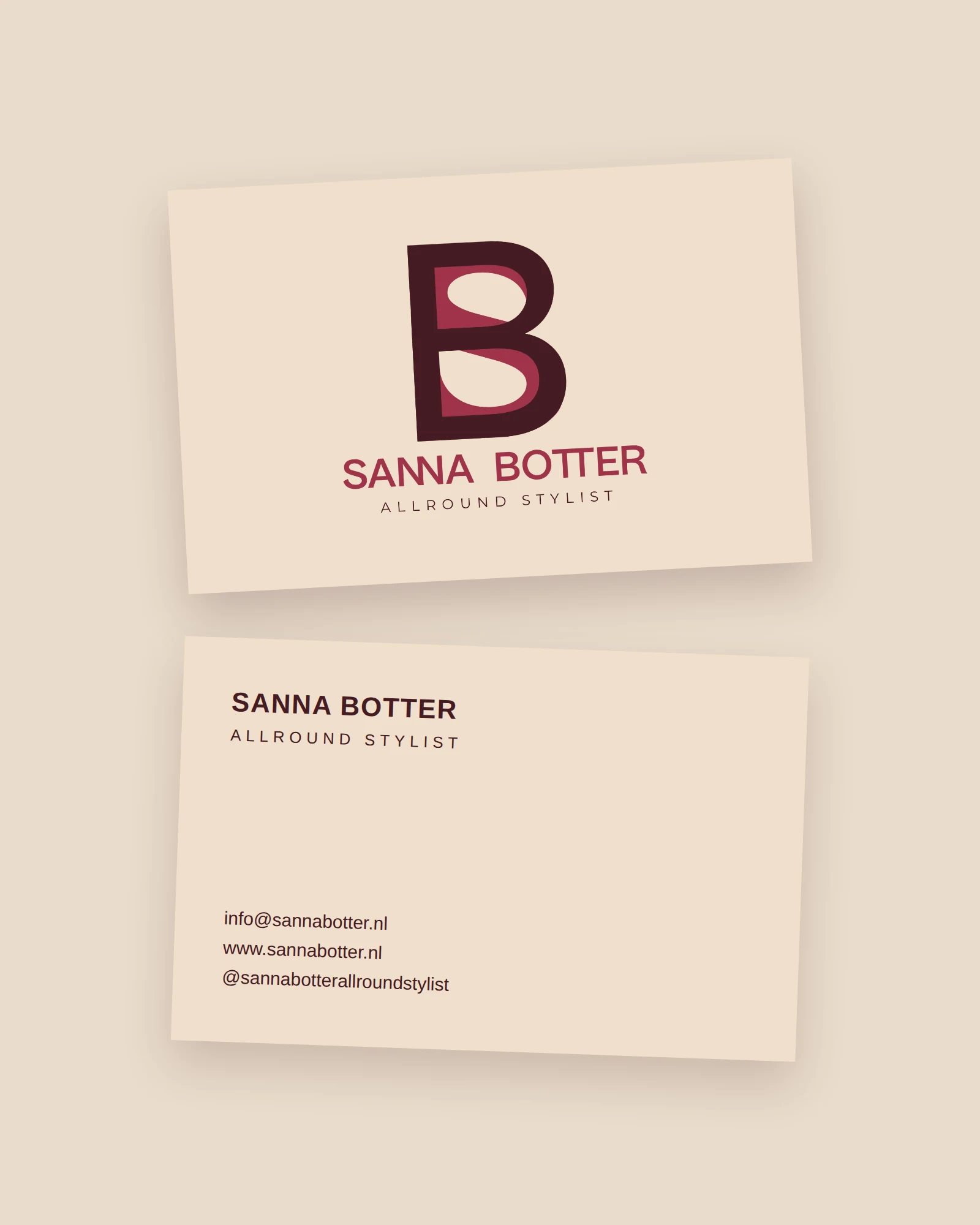
A personal brand for Sanna Botter, an all-round stylist. A monogram that weaves her initials together, in warm bordeaux, raspberry and sand, carried through a business card and a brand portal with every file in one place.
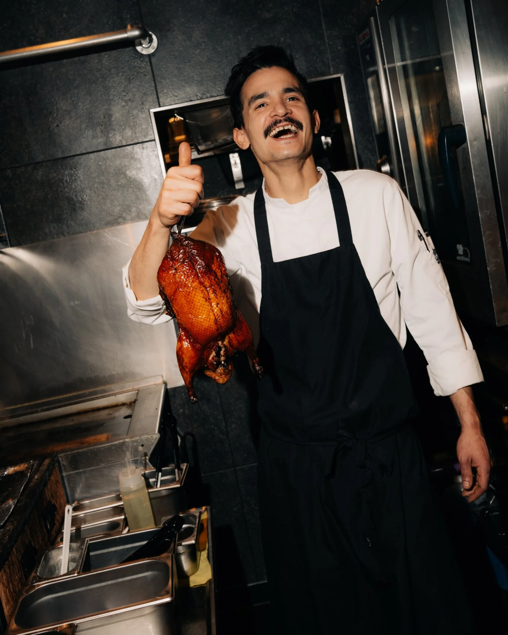
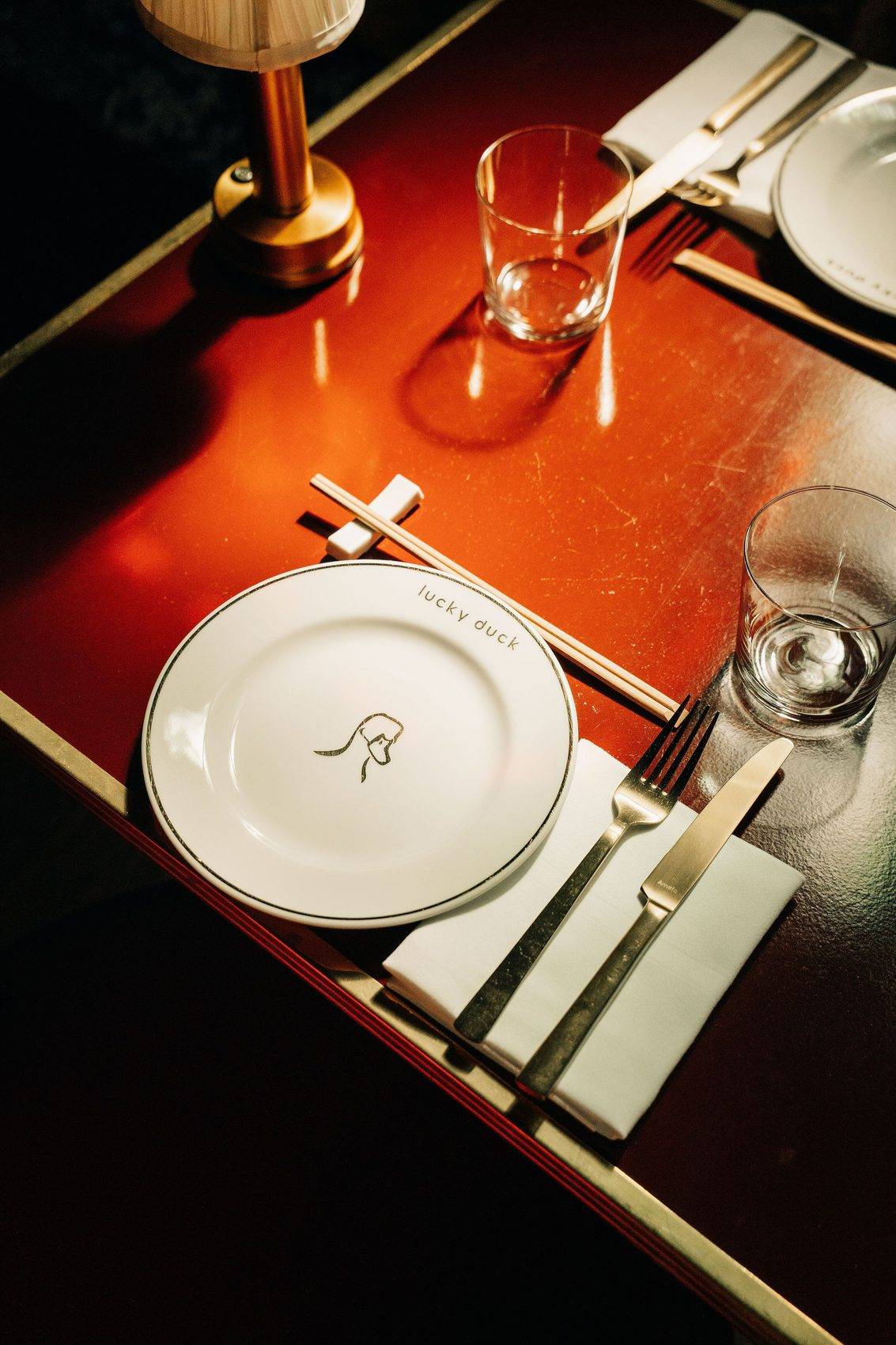
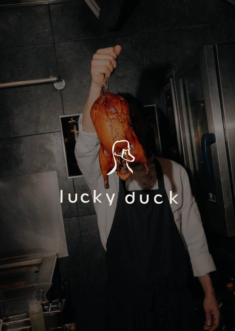
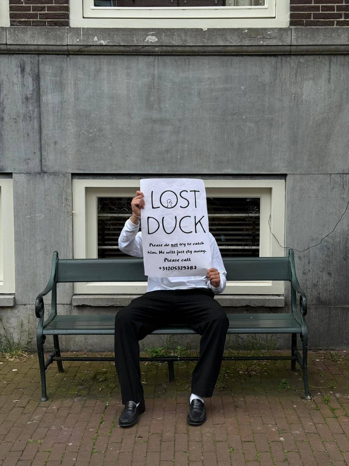
Lucky Duck, formerly known as ChopChop, is a modern Asian dining and cocktail bar in Amsterdam. The brief: a completely new name, while retaining the existing, recognisable look and feel.
After an extensive brainstorming session, we landed on the name Lucky Duck, a playful nod to one of the menu’s signature dishes: Peking duck.
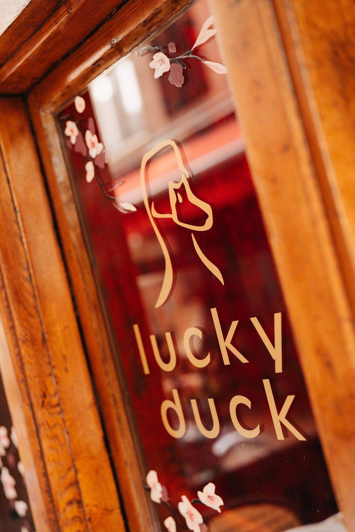
The challenge for the new logo was striking the right balance: playful enough to do the name justice, yet still chic and classy. What the client wanted to avoid at all costs was a look that felt like a touristy spot on the Zeedijk, Amsterdam’s red-light and tourist strip.
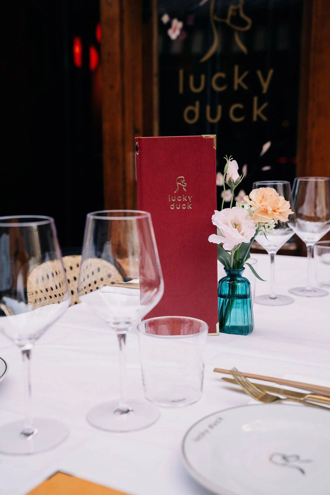
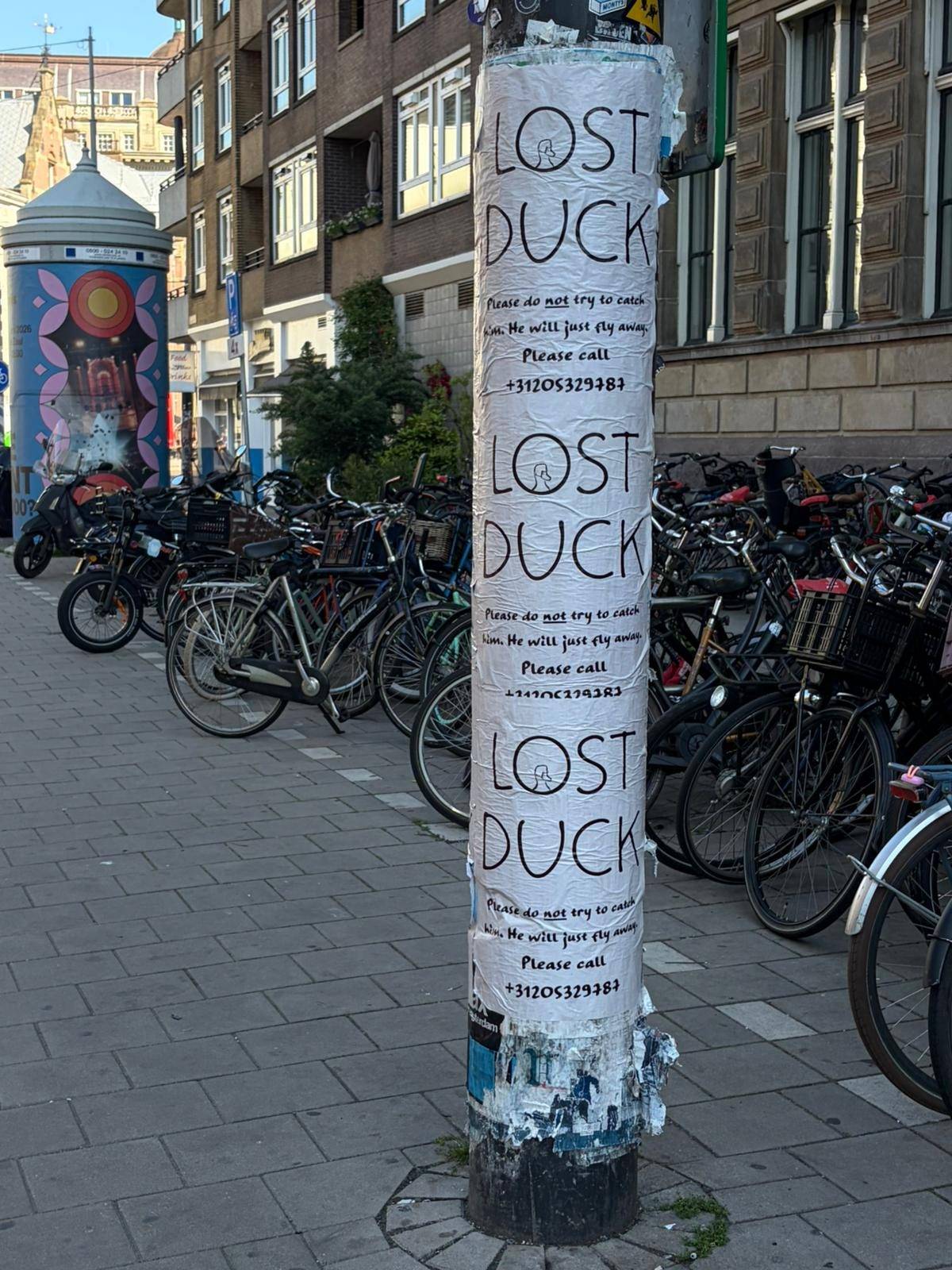
The result is a playful, lightly illustrated typeface paired with a more classically rendered duck as the brand icon. By consistently featuring this duck across every touchpoint, from the menu to social media, the brand has become instantly recognisable.

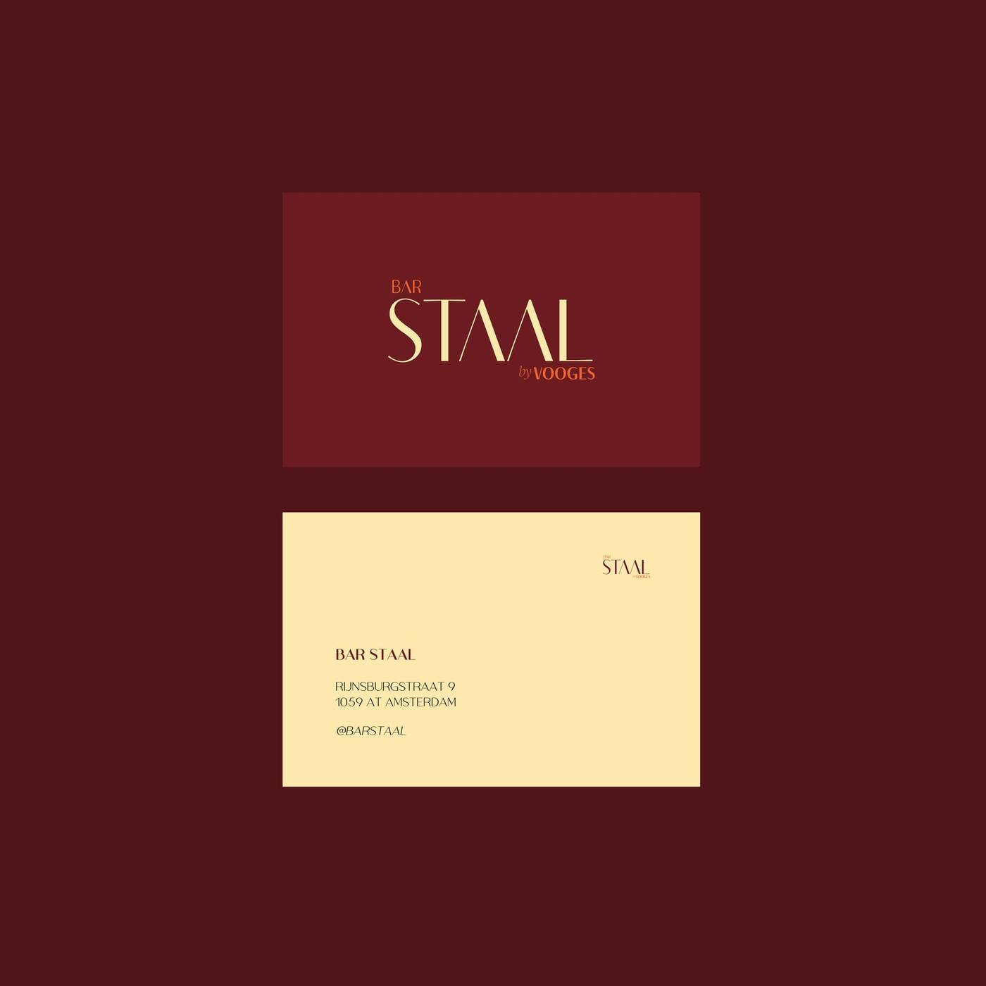
Bar Staal by Vooges is a new venture from the Vooges family, located on the Staalkade in Amsterdam. We were brought in to design the brand identity and logo.
The brief called for a chic, more refined look than Vooges’ own playful identity, while still incorporating the existing Vooges logo, so the family connection between the two venues remains clear.
The result is a house style that feels distinctly its own: elevated and understated where Vooges is playful, yet unmistakably part of the same family.
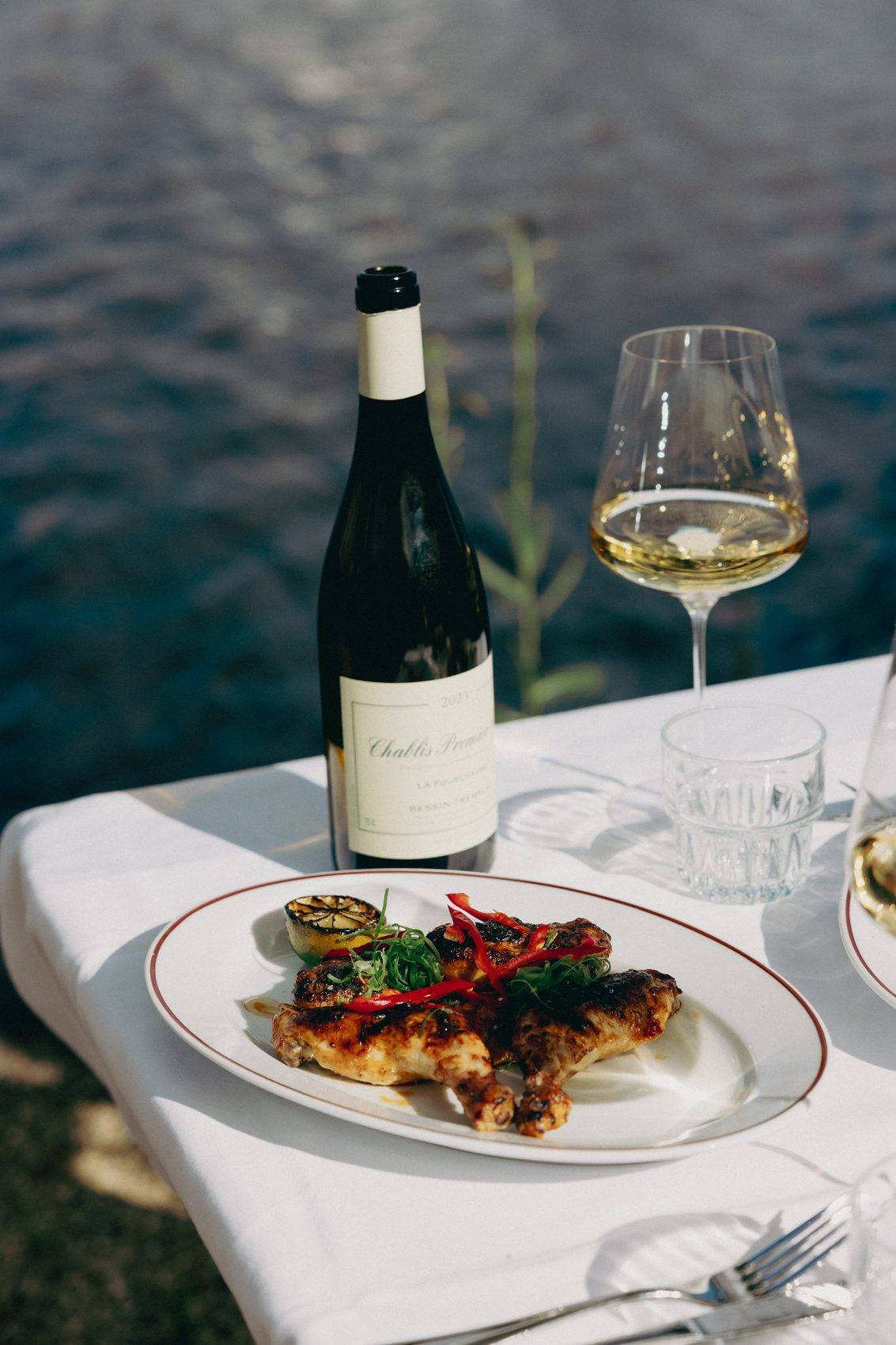

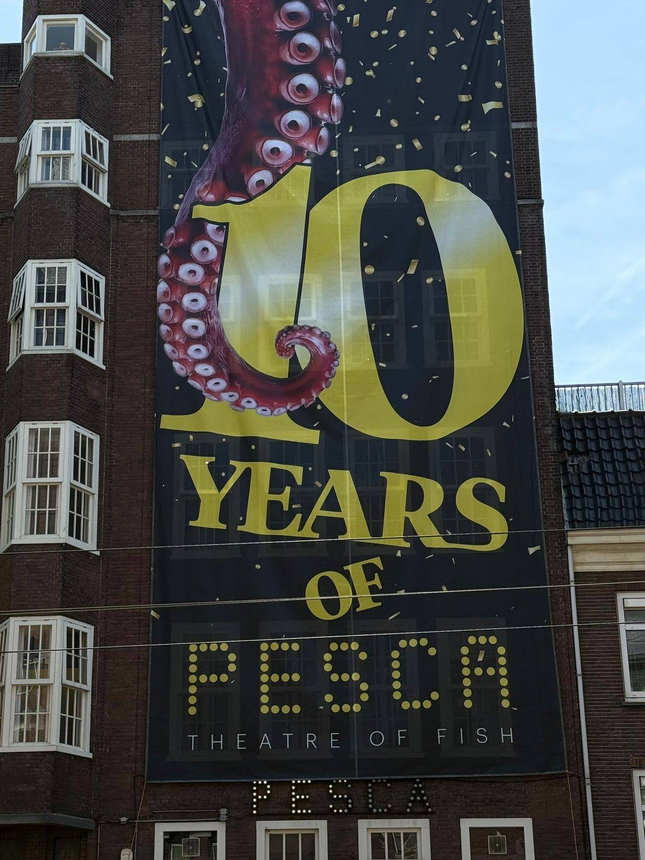
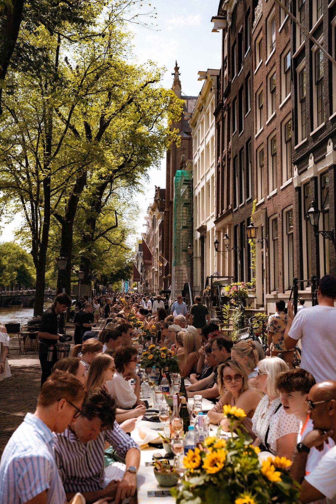
To celebrate Pesca’s 10th anniversary, the team set out to throw a signature Pesca Gamba Brunch on the canal for 1,000 guests.
Ahead of the event, we designed a large banner that hung across the restaurant’s building announcing the milestone, along with the graphics used across social media to promote the brunch.
The day itself was a huge success. On top of the design work, I joined the team on-site to help with preparation, ticket scanning, and handing out Pesca limoncello to guests, including, of course, a shot of my own.


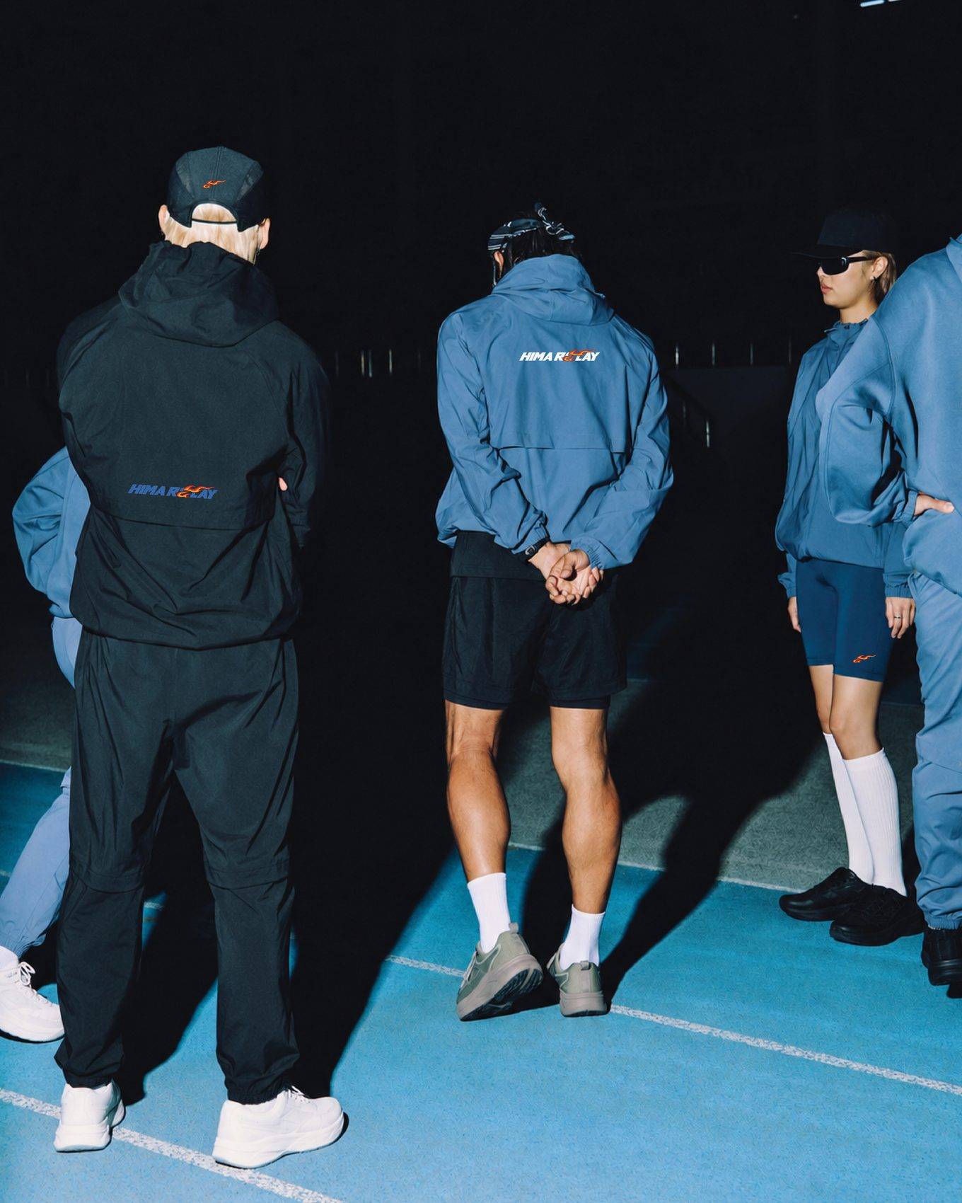
HIMA is an Amsterdam recovery brand built on the ritual of heat and cold: sauna, ice bath and taking the time to recover. For HIMA Relay, a night-long running event in collaboration with MOB, HIMA asked for a limited edition logo.
The format is simple: two runners, one night, 120 km. One runner is out on the road while the other recovers inside, and they swap every lap. Speed and recovery, side by side. So rather than creating something new, I built the Relay identity on top of HIMA: same brand, with one element added: motion.
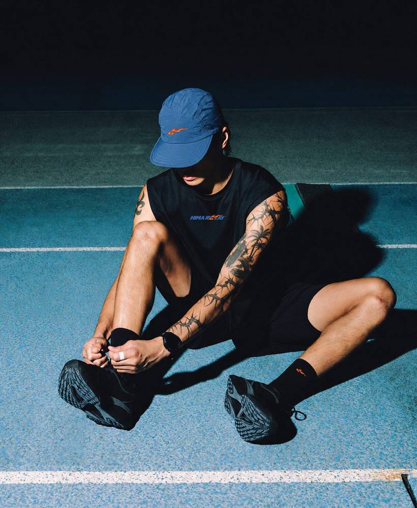
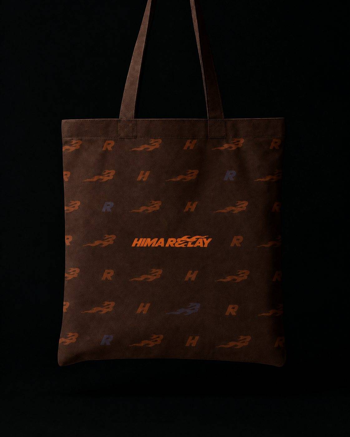
The wordmark is set in bold italic type, leaning forward like a racing logo. The flame is drawn the familiar way, in the old-school decal style of vintage race cars, retro sportswear and hand-painted signage.
The result is an identity that carries across the whole event, from running tops and jackets to caps, socks and a tote bag, where the H, the R and the flame come together in a repeat pattern.


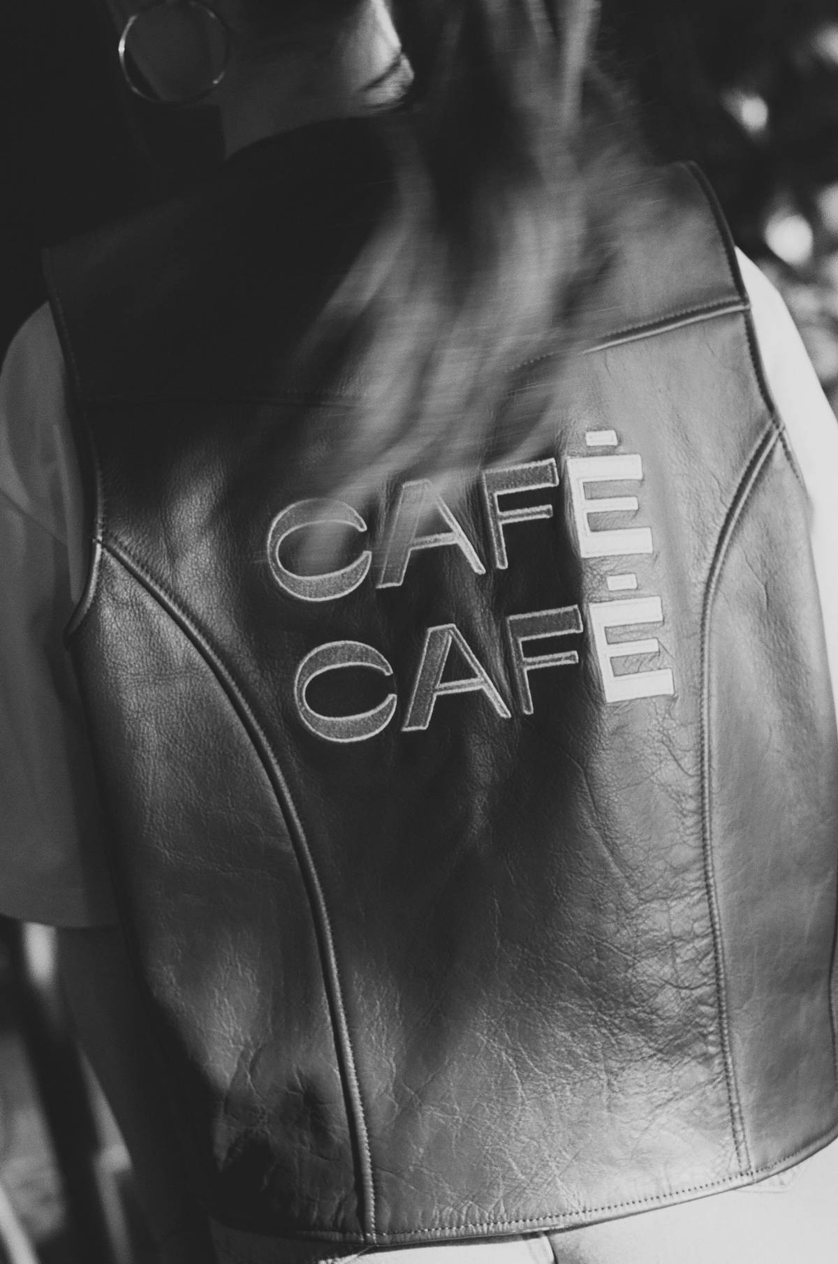
Café Café is a café-restaurant on the Amstel in Amsterdam, built around long tables, good conversations and something nice in your glass. My task was to extend its visual identity across everything guests hold in their hands.
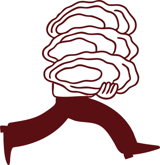
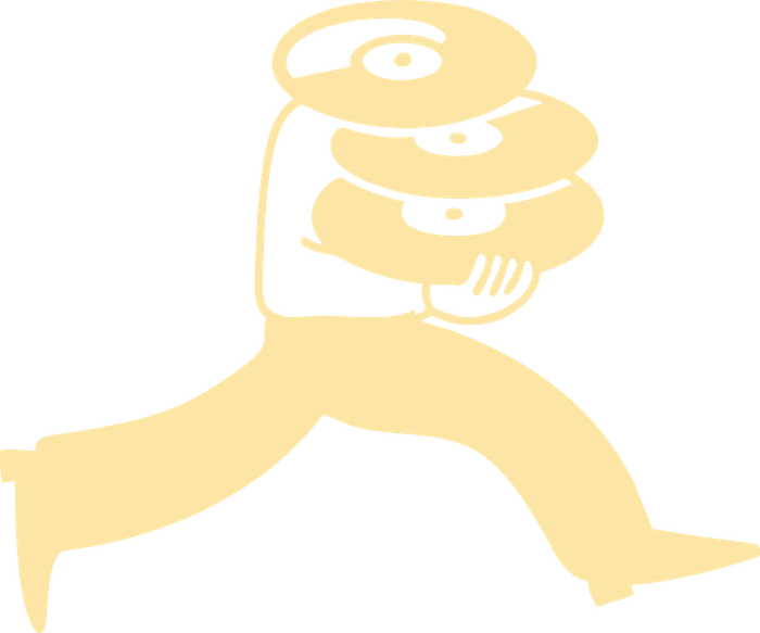
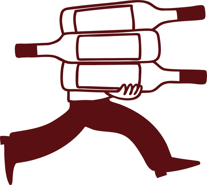
At the heart of it is a custom illustration library, all drawn by hand: loose, cheerful characters, from a woman running off with a bottle of wine to a figure dashing through the café with an armful of oysters, records or bottles. Never too serious, always up for another round, just like the café itself.
Paired with a warm palette of terracotta, orange and soft yellow and the typeface Neue Kabel, the illustrations run through every touchpoint: coasters, greeting cards, postcards, matchboxes, the full menu and the staff T-shirts. One of my favourites is a postcard for the neighbours, welcoming them to Café Café and treating them to their first drink.
The result is a brand language that feels as warm and welcoming as the place it belongs to.



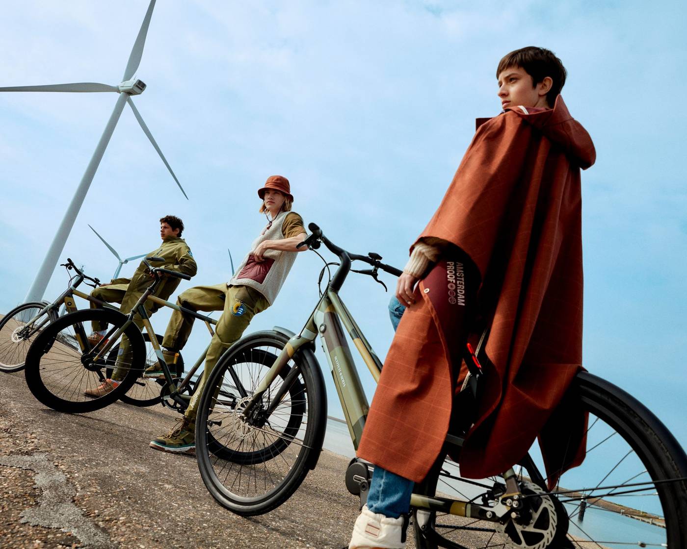
Amsterdam Proof is Scotch & Soda’s rainwear capsule collection, inspired by what it takes to face the Amsterdam weather. For the collection, Scotch & Soda teamed up with fellow Amsterdam brand Veloretti on a limited edition series of bikes.
I designed the complete print package for the bikes. At its heart is a dazzle camouflage built from the colour palette of the rainwear itself, in Dutch green, butterscotch yellow, cedar brown and midnight black. Alongside it sit solid colourways, including an exclusive Dutch green, finished with Scotch & Soda branding on the frame. That way, bike and rider come together as one look.
The print runs across four models, from the Ivy and Ace e-bikes to the Caféracer and Caféchaser city bikes, and was launched with a campaign shot in and around Amsterdam.
Campaign images: Scotch & Soda × Veloretti